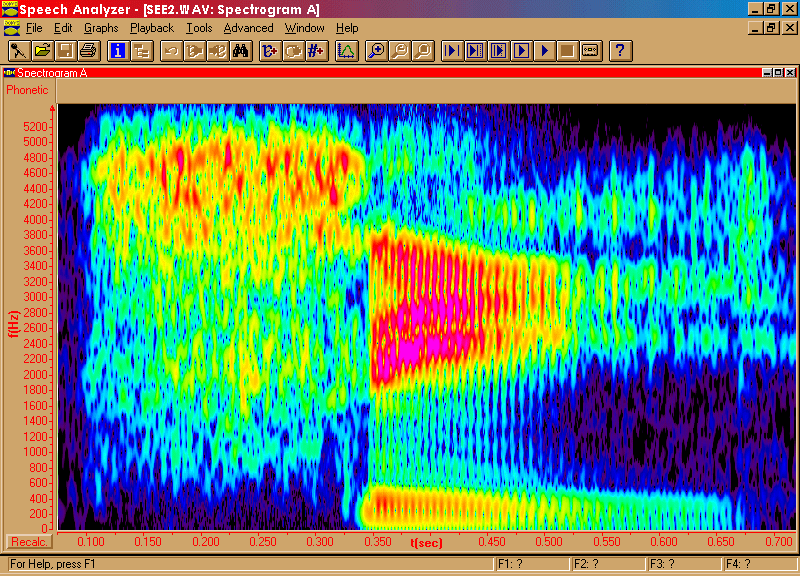
In a spectrogram, the vertical axis of the picture represents
the frequency scale: the lowest frequencies are shown at the bottom. From
left to right is the time axis, with the beginning of the sound analyzed
shown at the left. The degree of blackness of the markings shows the amount
of energy present in the signal at a particular point in time. Some spectrographic
displays now show levels of energy with different colours instead, but
although these look pretty and are nice to pin on your wall, most people
find they are harder to interpret than the grey-scale spectrograms that
have been around since the 1940s.
NEXT
PAGE